Reckon’ it’s happened to us all.
I have Facebook friends whose political rants make me want to hit them with a baseball bat. Metaphorically, of course.
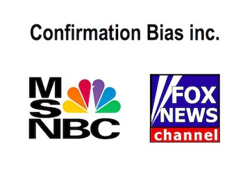
My friend Randy’s FB tirades are the most extreme left-wing drivel you can imagine. My friend Gort, a self-described liberal, has totally blocked his rants and hides under the bed when he calls. And they are best friends!
My friend Cooper is as right-wing as a one-legged chicken. He can’t even mention Hillary’s name without the liberal (pardon the expression) use of expletives. #@#$#@%$@.
Their diametrically opposed views are so categorically biased you’d think that Hillary and Donald were worthy of challenging Mother Theresa on sainthood.
What can we programmers learn from this silly little journey into social media mud rucking?
A better way to spend our time than a Facebook rant, I’d say.

What if it was the other way around?
What if everything we heard was something we knew was true in our hearts? What if every time they spoke we felt like they had been talking directly to us? What if we consistently heard things that affirmed our identify, encouraged us in our daily challenges, and gave us a glimpse at the best version of ourselves?
“The people we surround ourselves with either raise or lower our standards. They either help us become the best-version-of-ourselves or become lesser versions of ourselves. We all need people in our lives who raise our standards, who remind us of our eternal purpose, and challenge us to become the best version-of-ourselves.”
~John Maxwell
What if those things of value came from our favorite radio station?
My friends at KLTY in Dallas are giving $500 to listeners to help a friend. Even though the listener also receives $500, that is not the part that is resonating. They’ve tapped into their listeners’ value system that helping a friend is a meaningful thing to do.
KLTY is helping their listeners become a better version of themselves.
Or, we could just post another rant on Facebook!

